Cajasiete
Two landing pages designed to convert visits into account sign-ups, with zero distractions.
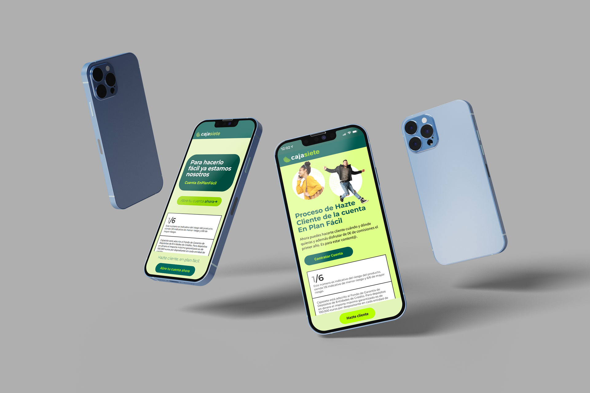
Caja Siete is a Canary Islands-based bank.
The project came to us through 22Grados, a local agency we partnered with to improve their digital presence with two landing pages and a series of social media banners.

The goal was crystal clear: ensure that every user who landed on the page ended up opening an account. No detours, no distractions, no friction. In banking, every extra click is a lost conversion.
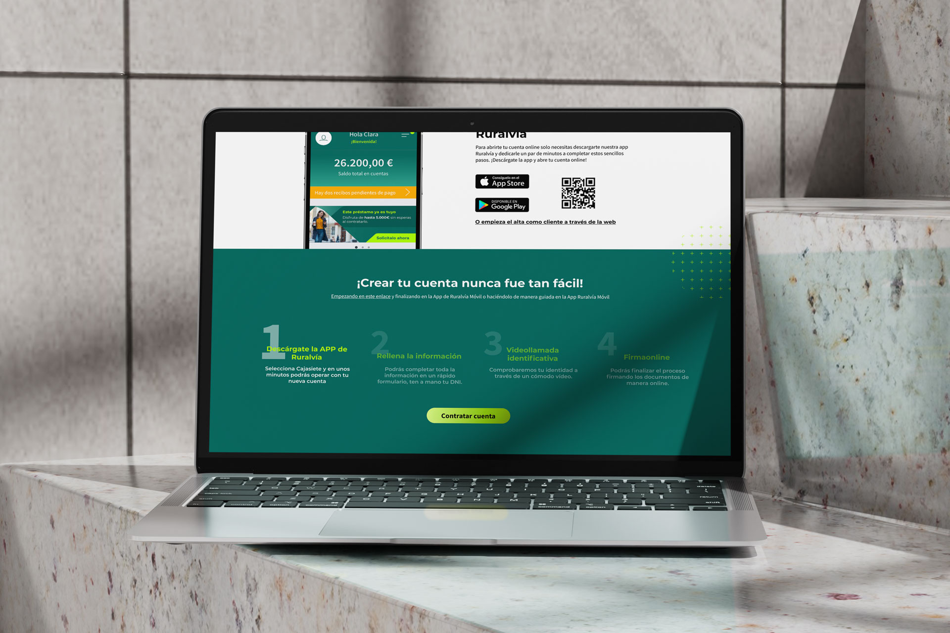
We applied CRO principles to design every element with a specific purpose. Visual hierarchy, CTAs, content layout—everything was crafted to guide the user in one direction. Before handing it off, we prototyped the entire flow so the client could walk through it and validate it before development.
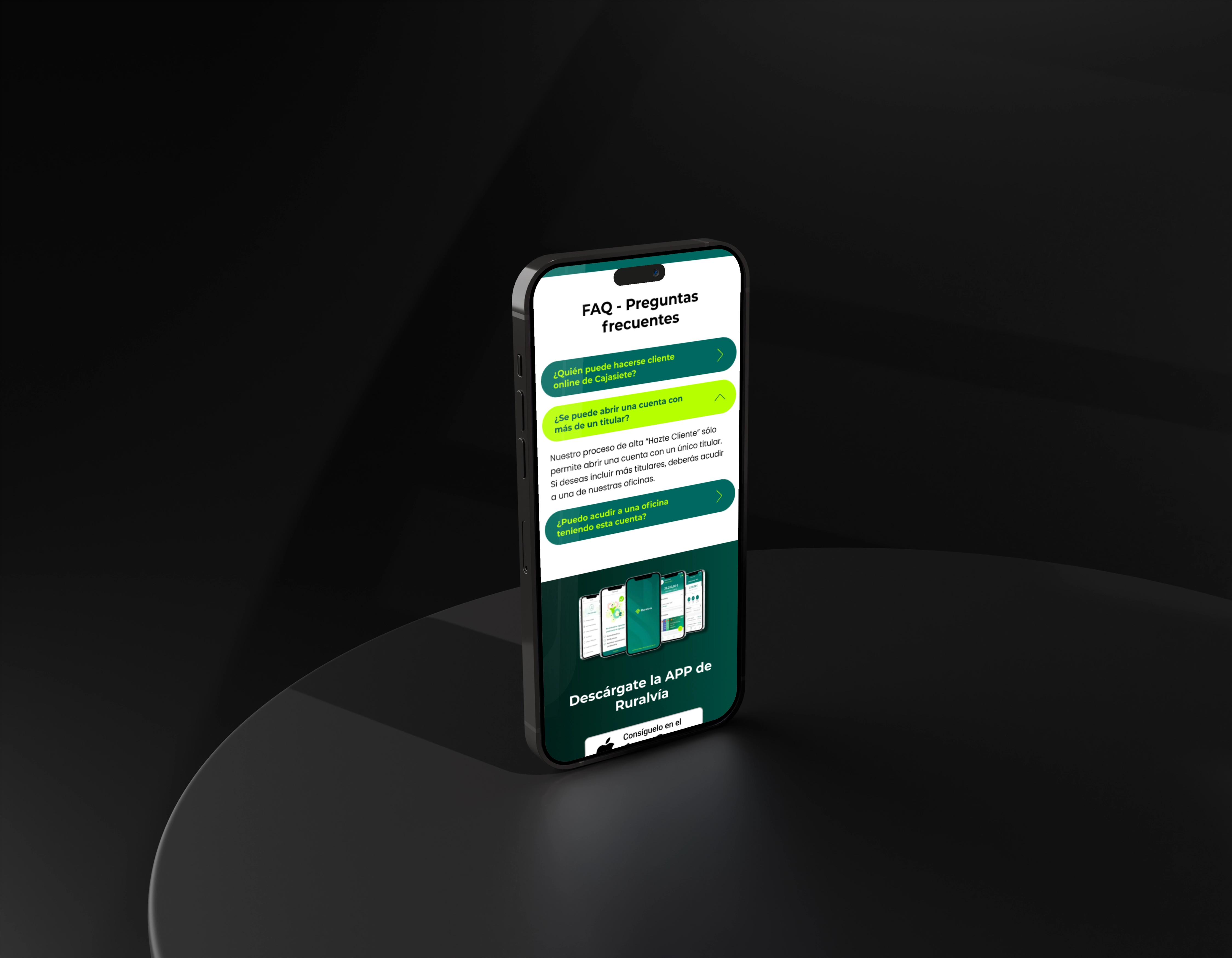
Two landing pages with a clean, direct design that aligns with Caja Siete’s identity. Modern, easy to navigate, and focused entirely on action. Anything that didn't contribute to the goal had no place on the page.
A design that converts because it was built for that purpose from the start, not just as an aesthetic layer on top of a broken structure.
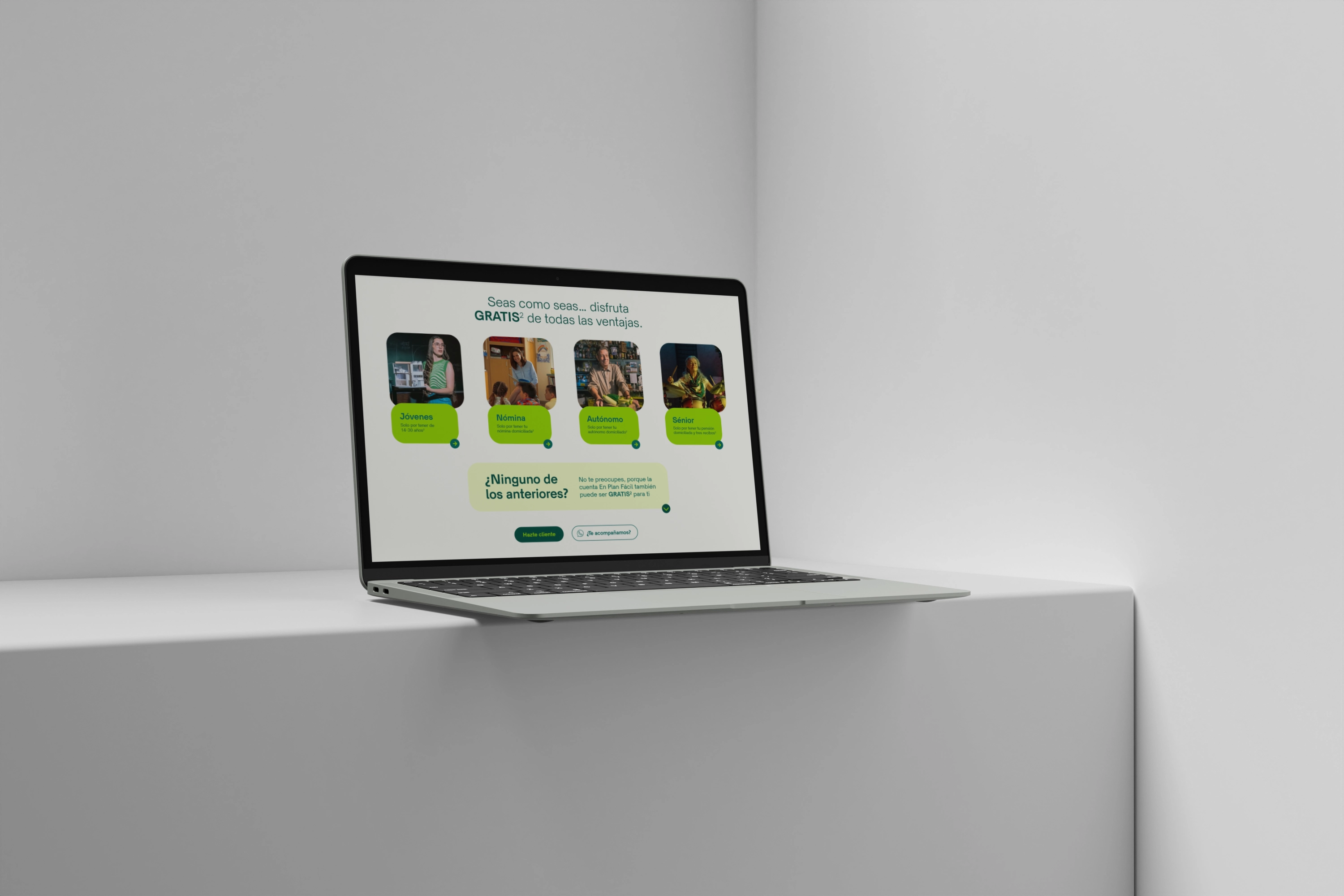
In landing page design, doing it right means removing everything that doesn't lead the user where they need to go.